Use Case — PropTech & Geospatial Intelligence
From 25 gigabytes of raw data
to a navigable 3D city
How we transformed the UK government's entire EPC dataset into a real-time interactive building map of Marylebone — no backend server, no framework, no approximations.
The challenge
Unusable by default. Invaluable if you know what to do.
The UK's Energy Performance Certificate register is one of the most complete public records of domestic energy efficiency in the world. It covers millions of properties. It is also, practically speaking, unusable out of the box — a 25 GB flat CSV file with no geographic coordinates, no building-level groupings, and no front end.
The brief was precise: target the Marylebone neighbourhood, and build something a property analyst, sustainability consultant, or planning officer could actually use — without standing up a server or paying for a database.
“The raw data exists. The question is whether you can make it speak. We needed every building in the street to tell its own energy story at a glance.”
Beyond the sheer file size, there was a second obstacle: EPC records contain addresses and a UPRN (Unique Property Reference Number) — but no coordinates. Mapping the data required joining it to a second enormous file, the OS OpenUPRN dataset (~2.1 GB), which maps every property reference in Great Britain to a latitude/longitude pair. Two enormous files. One coherent map.
The solution
A four-phase streaming pipeline — no RAM overload, no database.
We designed a Node.js pipeline that processes both source files in a single streaming pass each, keeping peak memory consistently under 1 GB throughout the entire extraction run on a standard laptop.
The visualisation
A real 3D globe. Real terrain. Real buildings. Real data.
The output JSON powers a fully static front end — a single HTML file using Cesium.js 1.137 loaded from CDN. Cesium renders the scene as a full WebGL globe with real terrain elevation data and OpenStreetMap-sourced building geometry extruded into three dimensions. Our data layer sits on top.
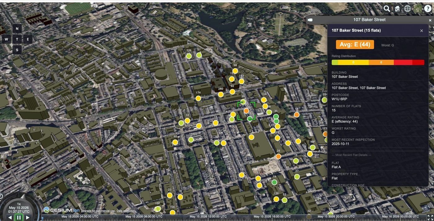
Each of the 65 buildings receives a colour-coded pin placed at its exact coordinates. Clicking any pin or extruded building slides in a panel showing the full breakdown — rating histogram, worst rating, floor area, heating system, estimated CO₂, and annual energy costs.
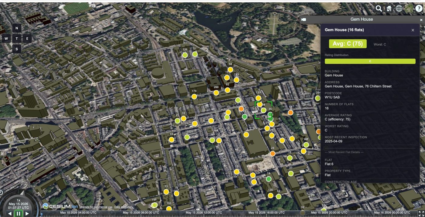
The contrast above captures exactly why the tool matters. Two buildings 300 metres apart on the same street grid: one consistently C-rated, one averaging E with individual flats reaching G. A planning officer or retrofit consultant can spot that difference in under three seconds — no spreadsheet, no commissioned report.
Technology stack
Four tools. No framework. No server.
What this unlocks
The same map. Four completely different user stories.
Architecture insight
The pre-computation boundary — the design decision that makes this work.
All the heavy lifting — streaming, joining, deduplicating, aggregating — happens once, offline, in Node.js. The browser receives only the distilled result. This pattern means the interactive experience is instant and deployment is trivially cheap: a static file host and a CDN is sufficient infrastructure for an application that summarises 27 GB of government data.
The same pattern scales without modification. Swap Marylebone for any UK postcode district. Swap EPC bands for planning permissions, flood risk scores, broadband speeds, or census data. The pipeline architecture remains identical — only the filter criteria and the aggregation logic change.
Ready to build?
Your dataset. Your neighbourhood. Your insight.
We build custom geospatial data pipelines and Cesium.js 3D visualisations for property, infrastructure, and public sector clients. Tell us your data problem and the audience who needs to understand it.